Introduction
Data visualization is one of the most critical skills to have in today’s data-driven world. Histograms are a valuable tool for analyzing and interpreting data. In this article, we’ll explore how to create histograms step by step, their importance in data analysis, how to create them in Microsoft Excel or Google Sheets, tips and tricks for creating professional-looking histograms, and different types of histograms and when to use them.
This article is suitable for anyone interested in improving their data visualization skills with histograms. Whether you’re a beginner or an expert, this comprehensive guide has something for everyone.
A Step-by-Step Guide on How to Make a Histogram: Improve Your Data Visualization Skills
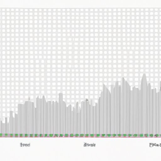
A histogram is a graphical representation of data that organizes it into a set of intervals or bins. Histograms are useful in displaying data that has a wide range of values. Histograms help to identify patterns, outliers, and skewed data.
Here are some steps to create a histogram:
1. Select the data you want to represent in the histogram.
2. Choose the number of bins you want to use. The bins represent the intervals that the data is grouped into. The more bins you use, the more granular your histogram will be.
3. Calculate the bin range by dividing the difference between the minimum and maximum value of the data by the number of bins.
4. Create the histogram by plotting the data points in each bin and connecting the points with bars or lines.
To create a histogram in Microsoft Excel or Google Sheets, follow these steps:
1. Open a new spreadsheet in Microsoft Excel or Google Sheets.
2. Enter the data you want to represent.
3. Highlight the data to be included in the histogram.
4. Click on the “Insert” tab.
5. Click the “Chart” button.
6. Select “Histogram” as the chart type.
7. Adjust the chart options such as bin width and axis labels as desired.
The Importance of Histograms in Data Analysis: Create Accurate and Effective Visualizations
Histograms are valuable tools for analyzing and interpreting data. They help to identify patterns, outliers, and skewed data. Histograms also provide a quick and easy way to make comparisons between different sets of data.
The use of histograms has several benefits. Firstly, histograms display data in a way that is easy to understand and compare. They are particularly good at showing the spread and shape of a distribution. Secondly, histograms provide a visual representation of data that is more engaging and accessible than tables or raw data. Thirdly, histograms can help to identify potential data errors such as outliers or data that may be skewed.
Creating Professional Histograms in Excel: Tips and Tricks for Data Analysis
Microsoft Excel is a powerful tool for creating histograms that are both attractive and informative. Here are some tips and tricks for creating professional-looking histograms using Excel:
1. Use descriptive titles and labels to provide context for the graph.
2. Color code bars to highlight specific data points or categories.
3. Add error bars to show the variability of the data.
4. Use a trendline to identify the direction and strength of the relationship between variables.
5. Adjust the bin width to get a more granular or broader histogram.
Different Types of Histograms and How to Use Them for Visualizing Complex Data
Histograms come in different types, and each type is suitable for different types of data analyses. Let’s explore some of the various histogram types:
1. Normalized Histogram: A normalized histogram rescales the data so that the area under the curve is equal to 1. Normalized histograms are useful when comparing datasets on different scales.
2. Cumulative Histogram: A cumulative histogram displays the cumulative frequency or percentage of data in each bin. Cumulative histograms are useful for visualizing the cumulative distribution function or CDF.
3. Grouped Histogram: A grouped histogram displays multiple datasets side by side. Grouped histograms are useful for comparing data from different sources or subgroups.
Histograms vs. Other Data Visualization Techniques: A Comparative Analysis
Histograms are not the only method for visualizing data. Other popular data visualization techniques include scatter plots, box plots, and bar graphs. Here’s a comparison of histograms with other data visualization techniques:
1. Scatter Plots: Scatter plots are useful for displaying the relationship between two continuous variables. Histograms are useful when we have one continuous variable and want to know how many values fall into different ranges.
2. Box Plots: Box plots provide a quick way of visualizing the distribution of data and identifying outliers. Histograms provide a more detailed view of the data distribution.
3. Bar Graphs: Bar graphs are useful for comparing discrete or categorical data. Histograms are useful when working with continuous data.
Conclusion
Histograms are useful tools for analyzing and interpreting data. They help to identify patterns, outliers, and skewed data. In this article, we’ve explored how to create histograms step by step, their importance in data analysis, how to create them in Microsoft Excel or Google Sheets, tips and tricks for creating professional-looking histograms, different types of histograms, and compared them to other popular data visualization techniques.
With this knowledge, you can create accurate and effective visualizations that can help you in data analysis. Try creating histograms and experimenting with different types, software, and customize it to your liking to improve your data visualization skills.


