Introduction
If you frequently work with data and charts in Excel, you might have encountered the need to create more complex visualizations that require multiple axes for different scales. This is where a secondary axis comes in handy, allowing you to plot different data onto the same chart with precision and clarity. Yet, many users struggle with this process and end up with charts that do not adequately represent their data. To address this challenge, this article offers a comprehensive guide on how to add a secondary axis in Excel.
A Comprehensive Guide on Adding a Secondary Axis in Excel
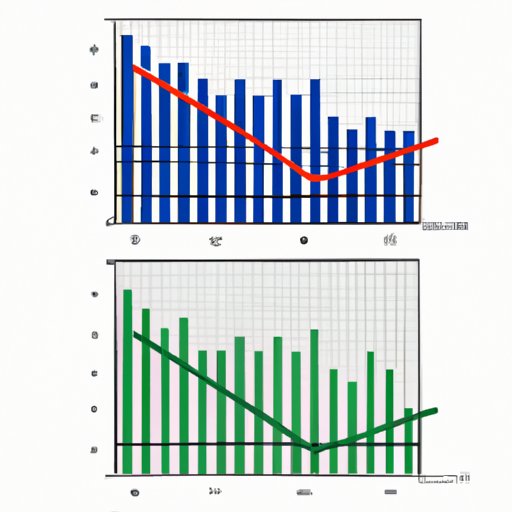
A secondary axis is an additional axis that allows for a different scale to be plotted on the same chart. It is particularly useful when comparing two sets of data that have different units of measurement or ranges of values. Some common scenarios when it might be useful to add a secondary axis are when comparing sales data with corresponding percentages, or when comparing temperatures with precipitation data.
Here’s how to add a secondary axis to your Excel chart:
1. Select the chart that you want to add a secondary axis to.
2. Click on the Chart Elements button (+) that appears next to your chart, and then select the Axes dropdown.
3. Select the Secondary Horizontal or Secondary Vertical option, depending on which axis you want to add.
4. Once you have added the secondary axis, you can choose to format it by right-clicking and selecting Format Axis.
5. In the Format Axis menu, you can set the minimum and maximum values, axis labels, and other display options.
It’s important to note that not all chart types are compatible with a secondary axis. Line charts, bar charts, and column charts are generally the most suitable for this, but some other types of charts may work as well. Additionally, formatting the secondary axis is just as important as formatting the primary axis, so make sure to spend time adjusting the settings until you achieve your desired outcome.
Tips to Make Your Charts More Informative with a Secondary Axis
Adding a secondary axis to your chart can offer numerous benefits, such as providing a clearer view of data relationships and facilitating more accurate analysis. However, to fully reap these benefits, it’s important to use the secondary axis correctly and effectively. Here are some tips and tricks to help you make your charts more informative with a secondary axis:
– Scale both axes properly: One common mistake is to scale the axes improperly, which can skew the view of data. Make sure to adjust both axes so that they represent the data accurately and proportionally.
– Choose appropriate chart types: Not all chart types will work effectively with a secondary axis. Line charts are usually the best option for showing changes in one variable over time, while bar charts and column charts work well for comparing multiple variables.
– Label your axes effectively: Axis labels should provide clear and concise information about what data is being presented. Use descriptive titles and units of measurement whenever possible.
– Use contrasting colors: Using contrasting colors for your data series can make it easier to read and interpret the chart. Make sure to use colors that are different enough to be easily distinguishable.
How to Create Charts with Dual Y-Axes in Excel
A dual y-axis is another type of chart with two axes that allows for more nuanced and precise data visualization. It’s particularly useful when comparing data sets with different ranges or units of measurement. Here’s how to create a chart with a dual y-axis:
1. Select the data that you want to plot on your chart.
2. Click Insert > Recommended Charts.
3. Choose the chart type you want to use, and then click on the All Charts tab.
4. Select the chart type you want to use and click it
6. Once you have added the chart with a dual y-axis, you can adjust the formatting in the same way as with a regular chart.
Dual y-axis charts can be useful for comparing data sets that have very different ranges of values, such as temperature and rainfall, or for showing absolute values versus percentages. However, it’s important to ensure that the data is presented honestly and accurately, and that the axes are properly scaled.
Top Mistakes to Avoid When Adding Secondary Axis in Excel
Adding a secondary axis can be a powerful tool for data visualization, but it can also be tricky to get it right. Here are some common mistakes to avoid:
– Not scaling the axes properly: Improper scaling can distort the data and make it difficult to interpret accurately.
– Choosing the wrong chart type: Not all chart types will work well with a secondary axis, so make sure to choose the right one for your data.
– Overcomplicating the chart: Adding too much information or too many axis labels can make the chart confusing and difficult to read. Keep it simple and straightforward.
Industry-Specific Examples of Adding Secondary Axis on Excel
Different industries may require different approaches to using a secondary axis for visualizing their data. Here are some industry-specific examples:
– Sales data: To show sales trends over time and the corresponding gross margins, a line chart with a secondary axis would work well.
– Financial data: To compare the performance of different stocks, a stacked bar chart with a secondary axis for percentage changes may be ideal.
– Scientific measurements: To compare temperature and humidity data, a scatter chart with two axes would work well.
Conclusion
Whether you are a data analyst, an accountant, or just someone who works with charts frequently, adding a secondary axis in Excel can help you gain deeper insights into your data. By following the step-by-step guide and tips provided in this article, you can create more informative and visually appealing charts that accurately represent your data. Remember to scale your axes properly, choose the right chart type, and use contrasting colors and clear labels. With the power of secondary axis and dual y-axis, you can unlock the true potential of your data visualization.


