Introduction
In today’s competitive business world, it’s more important than ever to make a good first impression. Your business card is often the first piece of marketing material a potential customer or partner will see, so it’s essential that it accurately represents your brand and makes a lasting impression. This article will explore the fundamentals of creating effective business cards, and provide tips and tricks for designing cards that stand out from the competition.
Creating a Business Card that Speaks for Itself: Tips and Tricks for Effective Design
A well-designed business card should be visually appealing, informative, and true to your brand identity. Here are some key elements to consider:
Layout
The layout of your business card should be clean, uncluttered, and easy to read. It’s important to keep in mind that your card will often be viewed quickly, so choose a layout that is intuitive and easy to navigate.
Typography
Choose a font that is easy to read and aligns with your brand identity. Avoid using more than two or three different fonts on your card, and make sure the font size is appropriate for the information being presented.
Color scheme
The color scheme of your business card should reflect your brand and be consistent with other marketing materials. Select complementary colors that help your text and branding stand out without being garish or overwhelming.
Branding
Make sure your business card includes your logo and other brand imagery that helps your potential clients or partners identify you.
Tips for Organizing Your Information Effectively
To ensure that your business card communicates the right information, it’s important to organize your content in a clear and concise manner. Here are some tips:
Prioritize information
Think about what information is most important to communicate on your business card. Make sure that your most important information is easily visible and legible.
Simplify language
Stick to simple, concise language that communicates your key selling points efficiently. Avoid using jargon or overly technical language that your potential clients might not understand.
Use bullet points or icons
Bullet points or icons can effectively organize your content. They can also be used to draw attention to specific selling points while keeping your text minimal.
Examples of Well-Designed Business Cards
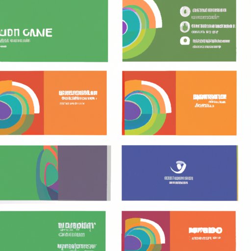
To get a sense of what a great business card looks like, take a look at examples from other companies in your industry. Look for designs that are clean, professional, and accurately represent the brand.
The Art of Business Card Design: How to Make a Memorable First Impression
Your business card is often the first point of contact between you and a potential customer or partner. Here are some tips to make sure your card is memorable and effective:
Experiment with shape and size
A uniquely shaped or sized business card can help it stand out from a sea of rectangular cards. Consider square-shaped cards, cards with rounded edges, or larger-than-normal cards.
Use striking imagery or graphics
Images or graphics can enhance your overall branding and effectively convey your message. Look for images or graphics that align with your brand’s identity and key selling points.
Consider adding texture or special finishes
Special finishes can give your card a high-end feel and make it more memorable. Consider embossing, debossing, foiling, or using unique materials like plastic or metal cards.
Examples of Memorable Business Card Designs
Take a look at some of the most memorable business card designs out there to get inspiration for your own design. From the playful to the chic, there’s plenty of inspiration to be found for creating something truly unique.
10 Rules for Designing a Business Card That Works Harder Than You Do
To create a business card that effectively communicates your brand and message, keep these ten rules in mind:
Keep it simple
A cluttered card can be overwhelming and difficult to read. Stick to the essentials.
Choose a readable font
Make sure your font is legible and aligns with your branding.
Use high-quality materials
Your business card should feel high quality and represent your brand well.
Include a call-to-action
Give potential clients or partners a clear next step.
Don’t overcrowd the card
Make sure there is enough white space to keep your card clean and organized.
Choose appropriate colors
Select complementary colors that accurately convey your brand identity.
Consider the printing process
Talk to your printer about the best options for your card.
Print on both sides
Take advantage of the extra space to communicate more information.
Consider special finishes
A unique finish can make your card stand out.
Proofread!
Don’t let spelling or grammar mistakes ruin your card’s effectiveness.
Examples of Business Cards That Follow These Rules
There are plenty of great examples out there of business cards that effectively follow these ten rules. Look to others in your industry for inspiration while continuing to make your card unique to your brand.
Boosting Your Business with a Visually Stunning Business Card Design
A visually appealing business card can dramatically improve your ability to engage potential clients and partners, so keep these tips in mind:
Use contrasting colors
Choose colors that stand out from each other to help your card truly pop.
Choose imagery that aligns with your brand
Select images or graphics that accurately reflect your brand’s identity and values.
Use interesting patterns or shapes
Patterns or shapes can add visual interest to your card while keeping it clean and professional.
Experiment with typography
Consider using fonts that are more expressive and unique than traditional typefaces.
Examples of Visually Stunning Business Cards
From cards with bright, eye-catching colors to minimalist designs with striking typography, there are countless visually stunning business card designs to take inspiration from.
Business Card Mastery: How to Create a Card That Reflects Your Brand and Leaves a Lasting Impression
Now that you know what goes into an effective business card design, put your knowledge to work with these step-by-step instructions:
Set your goals
Think about what you want to communicate with your business card and set clear goals.
Choose your design elements
Select appropriate fonts, colors, shapes, and imagery that align with your goals and brand identity.
Create a mockup
Use design software to create a mockup of your business card.
Get feedback
Share your mockup with others to get feedback.
Make final edits
Incorporate feedback and make any necessary final edits before going to print.
Encourage Your Readers to Try Out Their Skills and Create Their Own Business Cards
Creating an effective business card takes time and patience, but the results can be incredibly rewarding. Encourage your readers to take the lessons they’ve learned and create cards that effectively communicate their brand and message.
Conclusion
In today’s fast-paced business world, a well-designed business card is crucial for making a good first impression. By following the tips and tricks outlined in this article and experimenting with different design elements, you can create a card that perfectly reflects your brand and makes a lasting impression. Remember to keep it simple, prioritize important information, and experiment with colors, fonts, and finishes.


