I. Introduction
When it comes to data analysis, one of the most critical concepts to understand is relative frequency. This formula, which is used to find the proportion of a specific attribute in a data set, can help you identify trends, relationships, and patterns that might be otherwise hidden. In this article, we will explore how to find relative frequency, its importance in data analysis, and real-life applications.
II. Step-by-step guide to finding relative frequency
Before we dive into the step-by-step guide, let’s define the formula for relative frequency. Relative frequency is calculated by dividing the number of times a specific attribute appears in a data set by the total number of observations. This formula can be expressed as:
Relative frequency = (number of times attribute appears) / (total number of observations)
Now, let’s walk through each step of the process:
Step 1: Define the attribute you want to analyze
Before you can find the relative frequency of a specific attribute, you need to define what that attribute is. For example, if you are analyzing a data set of customer purchases, you might want to find the relative frequency of a particular product or category.
Step 2: Count the total number of observations
Next, you need to count the total number of observations in your data set. This could be the total number of customers, transactions, or any other relevant metric.
Step 3: Count the number of times the attribute appears
Now, you need to count how many times your chosen attribute appears in the data set. For example, if you are analyzing a data set of customer purchases for a specific product, you would count how many times that product was purchased.
Step 4: Calculate the relative frequency
Finally, you can calculate the relative frequency by dividing the number of times the attribute appears by the total number of observations:
Relative frequency = (number of times attribute appears) / (total number of observations)
For example, if you are analyzing customer purchases and your chosen product was purchased 500 times out of a total of 1000 transactions, the relative frequency would be:
Relative frequency = 500 / 1000 = 0.5 or 50%
This means that the product you analyzed appeared in 50% of the purchases made by customers in your data set.
III. Real-life applications of relative frequency
Relative frequency is a versatile tool that is used in many different industries. Here are some examples of how this formula is used in real-life applications:
Marketing: In marketing, relative frequency can be used to analyze consumer behavior. For example, a marketer might use this formula to determine the popularity of a specific product or to identify trends in purchasing habits.
Finance: Relative frequency is also used in finance to analyze market trends. For example, an investor might use this formula to evaluate the performance of a specific stock or to identify changes in market conditions.
Healthcare: In healthcare, relative frequency can be used to analyze patient data. For example, a researcher might use this formula to determine the prevalence of a specific disease or to identify factors that increase the risk of developing a particular condition.
IV. The importance of relative frequency in data analysis
Relative frequency is a critical tool in data analysis and statistics for several reasons:
Identifying trends: By calculating the relative frequency of a specific attribute, you can identify trends over time. For example, if you are analyzing customer purchases, finding the relative frequency of a particular product might help you identify whether its popularity is increasing or decreasing.
Identifying relationships: Relative frequency can also help you identify relationships between variables. For example, if you are analyzing healthcare data, finding the relative frequency of certain risk factors might help you determine whether there is a correlation between them.
Identifying patterns: Finally, relative frequency can help you identify patterns in your data. For example, if you are analyzing customer purchases, finding the relative frequency of certain products might help you identify which products are popular together or which products are often purchased at the same time of year.
V. Common mistakes to avoid when finding relative frequency
While relative frequency is a powerful tool, there are some common mistakes that people make when calculating it. Here are some of the most frequent errors to avoid:
Mistake 1: Not defining the attribute: Before you start calculating relative frequency, make sure that you have clearly defined the attribute you want to analyze. This will help you avoid confusion and ensure that you are analyzing the correct data.
Mistake 2: Counting the attribute multiple times: When counting the number of times an attribute appears, make sure that you count each instance only once. This will ensure that your calculations are accurate and that you are analyzing each observation correctly.
Mistake 3: Using the wrong total: Always make sure that you are using the correct total when calculating relative frequency. For example, if you are analyzing customer data, make sure that you are using the total number of customers, not the total number of transactions or purchases.
VI. Visualizing relative frequency
One of the most powerful ways to understand relative frequency is through visualization. Here are some common ways to visualize this formula:
Bar charts: Bar charts are a common way to visualize relative frequency. They can be used to compare the relative frequency of different attributes in a data set.
Pie charts: Pie charts are another way to visualize relative frequency. They can be used to show the proportion of a specific attribute compared to the total number of observations.
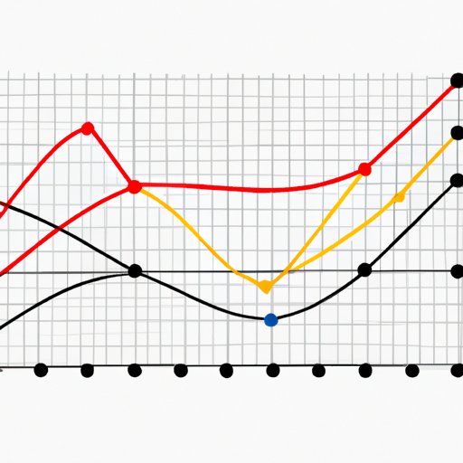
Line charts: Line charts can be used to visualize trends in relative frequency over time.
Scatter plots: Scatter plots can be used to visualize the relationship between two variables and their relative frequency.
VII. Conclusion
Relative frequency is a powerful tool that can help you identify trends, relationships, and patterns in your data. By following the step-by-step guide outlined in this article, you can ensure that your calculations are accurate and that you are analyzing the correct data. Remember to avoid common mistakes, and use visualization techniques to gain a deeper understanding of your data. With this knowledge, you can make informed decisions and develop actionable insights that will benefit your business or organization.


