Introduction
Graphs are an essential component of data analysis, communication, and presentation. They are a visual tool that helps the reader understand complex data and draw meaningful conclusions. However, creating a graph can be a daunting task for many people, especially those who are not familiar with data analysis or visual design. In this article, we will provide a comprehensive guide on how to make a graph that looks great and communicates data effectively.
Step-by-Step Instructions
Before delve deeper on how to make a graph, you need to have data set ready to analyze and visualize. Once you have the data, follow these simple steps to create an effective graph:
- Open your desired graphing tool (Microsoft Excel or Google Sheets or any other graphing software)
- Make sure your data is entered correctly and is organized according to the graph you want.
- Select the chart type that fits your data set, then fill in your data and make formatting changes.
- Choose graph title, axis labels, and any other relevant labels.
- Format your graph to improve readability, enhance contrast, and adjust the overall design.
- Save your graph in the desired format, such as PNG, PDF, or JPEG.
While these general guidelines will work for most graphs, make sure to read your desired graphing software’s instructions on how to best format and save your final graph.
Comparison of Popular Graphing Tools
Selecting the right software for your needs is crucial for creating an effective graph. Here is a comparison of the features, pros, and cons of popular graphing tools:
- Microsoft Excel: Microsoft Excel is the most commonly used software for creating graphs. It has a range of pre-built templates for expressing a wide variety of data and a lot of add-ins that can enhance the graphing process, but can be costly for personal use.
- Google Sheets: Google Sheets is a free, cloud-based alternative to Excel with a similar range of graphing tools. Google Sheets can only do basic manipulation and charting of data, but it is a great option for collaborative projects and is easily accessible through a Google account.
- Dedicated Graphing Software: There are specialized graphing software options such as Tableau, NVivo, etc., for advanced data visualization and analysis. These tools are powerful for creating and manipulating complex graphs, but require more intensive learning curves and are more expensive in comparison.
No matter which software you choose, make sure to assess your needs and budget and find the best fit for your specific circumstances.
Choosing the Right Graph for Your Data
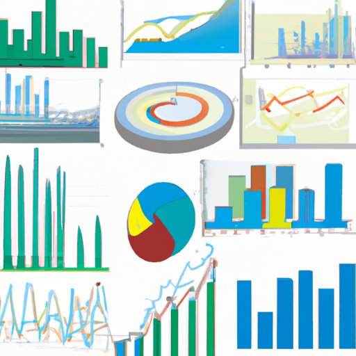
The success of the graph depends on the type of graph you choose to represent your data. Here are some of the most common and useful types of graphs:
- Line Graphs: These demonstrate trends over time and are best suited for continuous data points with an independent variable.
- Bar Graphs: These compare categories of data, often with an independent and a dependent variable. They show differences between two or more data sets and allow a quick comparative analysis.
- Histograms: These graphs are similar to bar charts, but work best with frequency data. Histograms show the range of values along the horizontal axis and the frequency of that value along the vertical axis.
- Pie Charts: Used to show percentages or parts of a whole, these charts allow comparisons between the parts to see how they relate to the whole. However, some avoid using pie charts in their data analysis, as the comparisons between pieces are often difficult to judge in a quick assessment.
- Scatter Plots: These are used to show correlations between two or more variables.
- Area Charts: These are used to indicate changes in quantities or trends for multiple data sets.
Choosing the right chart type is crucial for your data’s representation and the interpretation derived from it. Before selecting the chart type, be sure to research the positive and negative attributes of each graph and what sorts of information they effectively communicate.
Tips for Creating Visually-Appealing Graphs
An effective graph should both look good and communicate data in a clear manner. Here are some essential tips for designing a visually appealing graph:
- Choose the Right Color Scheme: Color choices can significantly enhance or disrupt your graph. Use colors that are visually appealing and don’t clash when used together.
- Use Appropriate Fonts: The text used in the graph should be legible and large enough for the reader’s eyesight. Font size plays a significant role in the readability of the graph. Use fonts that flow well and align with the chart subject matter.
- Properly Size the Chart: The chart should be scaled to fit the size requirements of the document or presentation in which it is included. Adjusting the size and dimensions of the chart allows the reader to view it as intended on their electronic device or print copy.
By using these tips, the graph can be both visually pleasing and convey important information.
Real-World Examples of Effective Graphs
Learning by example is the best way to improve your graph-making and data representation skills. Here are some examples of effective graphs:
- Infographic Posters: These posters combine visual data and graphic design to present information in a fun and informative way.
- Online Interactive: These graphs not only provide information but also allow the user to interact with or adjust the data, making it an intuitive and engaged experience.
- Simple Bar Graphs: These are a plain, straightforward way to present data in a reader-friendly manner.
These examples demonstrate how to effectively use the graph creation process to communicate information in a visually pleasing manner while staying true to your unique voice and message.
How to Interpret Graphs
While creating graphs is essential to communicate information, understanding how to interpret them is just as crucial. Here are some tips for reading and interpreting graphs effectively:
- Identify Trends: Look for patterns in your graph, such as a rise or fall in data points.
- Understanding Axes: Both the x-axis and y-axis must be correctly labeled, and the origin point and spacing must all be considered when interpreting the data. Abnormal ranges or skewed data can distort the overall graph.
- Identify Outliers: Single points in the graph that do not follow the trend may represent data anomalies. Identify these points and consider their meaning in the overall analysis.
Interpreting the graph ensures that your data understanding remains clear and easy to communicate. Post-analysis, it can also provide meaningful insight into trends and allow you to draw conclusions from your collected data set.
Conclusion
Making a graph that looks great and communicates data effectively is not as daunting as it may seem. By following these guidelines, you can successfully create compelling visual graphs that communicate your message and data. Remember to always research chart types, compare software, practice good design, and then analyze your interpretation to make a meaningful and impactful graphic.
For more resources on creating a graph and staying up-to-date on current trends in graphic design, many online sources are easily accessible for your continued education.


