Introduction
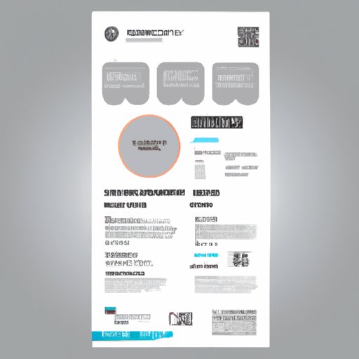
Flyers are an excellent way to promote your business, a concert, a community event, or fundraiser. Whereas digital advertising has its place, flyers serve as a tangible and immediate way of engaging with potential customers and promoting your services or products to the wider public. But how do you create an effective flyer? In this article, we provide you with a comprehensive guide to making flyers that catch people’s attention and help you achieve your desired outcome.
Step-by-Step Guide
Before designing a flyer, it’s essential to understand what tools and resources you’ll need to get started. These include a computer, graphic design capable software, a printer, and high-quality paper.
After gathering the necessary tools and resources, the next step is the design process. Brainstorming about the message you want your flyer to convey is a great place to start. Sketching the draft of your flyer before working on the computer is highly recommended. Furthermore, choosing a color palette and typography to help present the flyer’s message clearly.
Once you have an idea of the flyer’s design, it’s time to create it on your computer. Choose from a range of software from popular graphic design software like Adobe Photoshop, Canva, or Adobe InDesign, among others. When using software, it is essential to keep in mind the required DPI (dots per inch) to avoid producing low-quality print copies.
After finishing your design, the next step is to print your flyer using high-quality paper to ensure that it stands out compared to other flyers. The standard paper size is usually 8.5 x 11 inches, but this can vary depending on the purpose of your flyer.
When it comes to distributing flyers, it is recommended to design a distribution strategy that targets your specific audience. Post them in relevant locations, deliver them door-to-door, or distribute them at events related to your product or service. Always ensure you comply with any rules and regulations regarding signage, postings, and distribution in public spaces.
Design Elements
Design elements are significant in creating an effective flyer since they can make all the difference between a good and great design. The elements of a flyer include color, typography, and images and graphics, to name a few.
Typography is the art of arranging text to make it legible and visually appealing. The right font depends on factors like your brand identity, the design of your flyer, and your target audience. Always aim to use fonts that are legible and not too fancy or complicated and mix up various font styles to add contrast and interest.
Color theory is a crucial aspect of graphic design; choosing a color combination makes the design more appealing and accentuates the flyer’s message. Be sure to use complementary colors that offer balance and contrast. A design that’s too dull or lacks originality will not stand out and may not generate attention.
Images and graphics play an essential role in making a flyer dynamic and attractive. Choosing images that are high quality and reflect the flyer’s message and intent attract the desired audience. It is recommended that the image on the flyer takes up at least a third of space.
Visual Tutorials
Visual tutorials can help prospective designers learn the creation process effectively. They provide an opportunity to understand processes that would be challenging to learn in merely words. Designers can use videos or create GIFs to showcase the process of creating a flyer more intuitively.
Applications that support visual tutorials include Adobe Photoshop, Sketch, and Canva, among others. These visual tutorials offer non-designers an opportunity to learn and develop their design skills.
Best Practices and Tips
Selecting the right paper types, font sizes, styles, and other design techniques will help make your flyer stand out. Be sure to double-check and proofread all content before printing to avoid errors, and always consider the target audience and where to distribute your flyers.
Using bold text, the right color scheme, and selecting the appropriate images to reflect the message you want to convey makes your flyer more visually appealing. When distributed to the intended audience, your flyer should immediately stand out and relay its message accurately.
Choosing the Right Software/Applications
Choosing the right design software for your flyer design task can make a tremendous difference in the output quality. Some of the popular software and applications used for creating flyers include Adobe InDesign, Adobe Illustrator, Sketch, and Canva, among others. It is essential to understand the design tool requirements before choosing software to minimize risks.
When making your decision, consider factors such as ease of use, functionality, and output quality, among others. Some of these tools require monthly subscriptions for full feature access, so keeping an eye out for those with free versions that still provide significant features can be helpful.
Examples/Case Studies
One of the best ways to create an effective flyer is to see examples and case studies of other successful flyers. Vistaprint has a wide range of examples of flyers for various companies that you can use as inspiration. Companies like Nike, Coca-Cola, and McDonald’s have also made successful flyers that you can study to draw inspiration from.
It is also crucial to follow the same design principles and incorporate them into your flyer. Be original, hold to your brand identity, select the right colors, typography, and images, among others.
Conclusion
Making flyers able to achieve the desired goals is no mean feat, but by following the steps outlined in this article, you can create a flyer that catches people’s attention. From understanding the tools you need to understanding the design elements and visual tutorials, be sure to use these tips and tools for the best outcome possible.


